
Leading design as a body-scanning app grew into a fashion platform
I joined Verifyt when it was a body-scanning app and stayed as it grew into a fashion platform. Over five and a half years I designed across the consumer app and partner products, built the design system and led a team of 4–6 designers.
Context

Where Verifyt started
Body scanning and the WebSDK were already established when I joined. My work began with improving the scanning experience and expanded into discovery, wardrobe, outfit creation and shopping.
As these features grew, I designed how users moved between them and worked with product and engineering to define scope and support implementation. I also built shared design standards and led the growing design team.
Experience
Verifyt app: Connecting discovery, styling and shopping
My work covered the journeys between finding inspiration, exploring clothing and putting an outfit together.
Beyond Verifyt app
Alongside the consumer app, I designed co-branded apps, WebSDK experiences and a client BI Portal. These brought Verifyt’s scanning and sizing tools into partner products, with interfaces adapted to each brand and platform.


I adapted the app experience to each partner’s visual identity. Some apps combined the brand’s mobile website with native scanning features, bringing shopping and body scanning into one place.

For the website, I planned the site structure and proposed the visual direction. Other designers completed the final UI, with copy provided by the business development team.
BI Portal
I designed a portal for brands to access customer measurements and see how shoppers used Verifyt on their websites. The measurements also supported services such as custom clothing.
My work focused on the experience around Verifyt’s sizing widget on partner websites. Shoppers scanned a QR code using the Verifyt app to sign in and get size recommendations. Those without a body scan were prompted to complete one in the app.
Key decisions
01
Make body comparisons easier while browsing

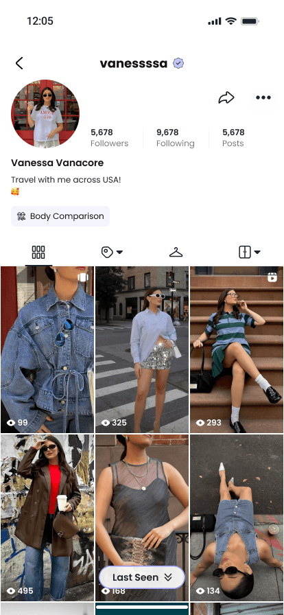


Originally, users had to open a creator’s profile and tap “Body comparison” to compare chest, waist and hip measurements. This gave them a detailed breakdown, but it was difficult to see how similar their bodies were while browsing looks.
We added Body Match directly to posts, showing a percentage based on how closely the creator’s measurements matched the user’s own. We also renamed the profile’s “Body comparison” button to “Body Match” to keep the wording consistent. Users could now check their match at a glance and tap through for a detailed comparison.
02
Make sizing information easier to use across products


I worked on sizing guidance across the Verifyt app and partner websites. On product pages, shoppers could see a recommended size, compare measurements in a size chart and read other shoppers’ feedback on fit.
Testing revealed three problems: the recommendation section was too long, the chart was difficult to scroll, and users weren't sure how to use the sizing options.
I shortened the recommendation to one line, kept the user’s size row pinned while they explored the chart, and revised the Fit Reviews label to make clear that it showed other shoppers’ feedback.
We then adapted the same approach for the smaller WebSDK widget, keeping sizing guidance consistent across the app and partner websites.


03
Organise design files by feature
As the product grew, our design files became slow and difficult to navigate. I reorganised them by feature so designers and engineers could find the relevant screens more easily. I also maintained the design system and UX writing standards to keep the work consistent.

04
Stay involved through implementation
I worked with product and engineering on priorities and scope, supported designers through reviews and mentoring, and stayed involved in handoff and release testing. This helped me catch interaction, copy and layout issues during implementation.
Impact
Over my time at Verifyt, I contributed to its expansion from a scanning-focused app into a broader fashion, styling and shopping platform.
My work spanned consumer experiences, partner products and the systems supporting the design team:
Design Foundations
Built and maintained the design system (type, colour, iconography, components), established UX-writing standards and reorganised design files by feature.
Verifyt app
Onboarding and login, Body and Foot Scan, Measurements, Inspiration Feed, Search, Wardrobe, Outfit Builder, Menu, Virtual Try-on, Shopping, Community.
AI
Vera, the AI stylist: entry point, outfit recommendations, initial Pro paywall.
B2B
Co-branded apps, WebSDK experiences and the client BI Portal.
Website and launch materials
verifyt.com (information architecture), the school community sign-up flow, app store listing visuals.
Feedback loop
In-app bug reporting routed to Jira, feature-idea and scan-feedback forms, design input into focus groups.
Team and delivery
Led 4–6 designers while remaining involved in design, handoff and release testing.
Reflection
Help users reach the useful parts sooner
Working on Verifyt taught me that adding a useful feature was only part of the job. People also needed to find it and understand how it could help them. The campaign analysis showed that few users reached outfit creation. If I did it again, I'd test a first-time flow that gets users to their first outfit sooner, and track whether it gives them a reason to come back.
Make handoff and review more explicit
I learnt to confirm when updated assets would arrive and review each new version, even when it looked similar to the previous one. I also learnt to share a complete, up-to-date design with business development, including sections that had already been approved. This gave everyone the same context when reviewing the experience with clients.
Client reviews also showed me how much small visual details could matter. The scanning tutorial model had visible facial features, and clients asked whether the app was capturing faces. Now I check what an illustration says about the technology, not just how it looks.
Question what each client needs to see
Working on the BI Portal taught me to question which measurements and analytics each client actually needed. Early assumptions about showing all available data did not always match what clients wanted in later reviews.
I would address those questions earlier: what should be visible, what should be configurable, who should have access and how users understand what they are sharing. These decisions belong in the initial design discussions.


